ACADEMY MUSEUM OF MOTION PICTURES
REBRAND
American Museum of Motion Pictures currently features a distinctly prestigious and luxury branding archetype. their website features a black background with brushed gold color for text and other accent pieces. Their logo is featured on a square shape with academy museum runing vertically on both sides of a centered oscar. visually it resembles an old movie ticket.
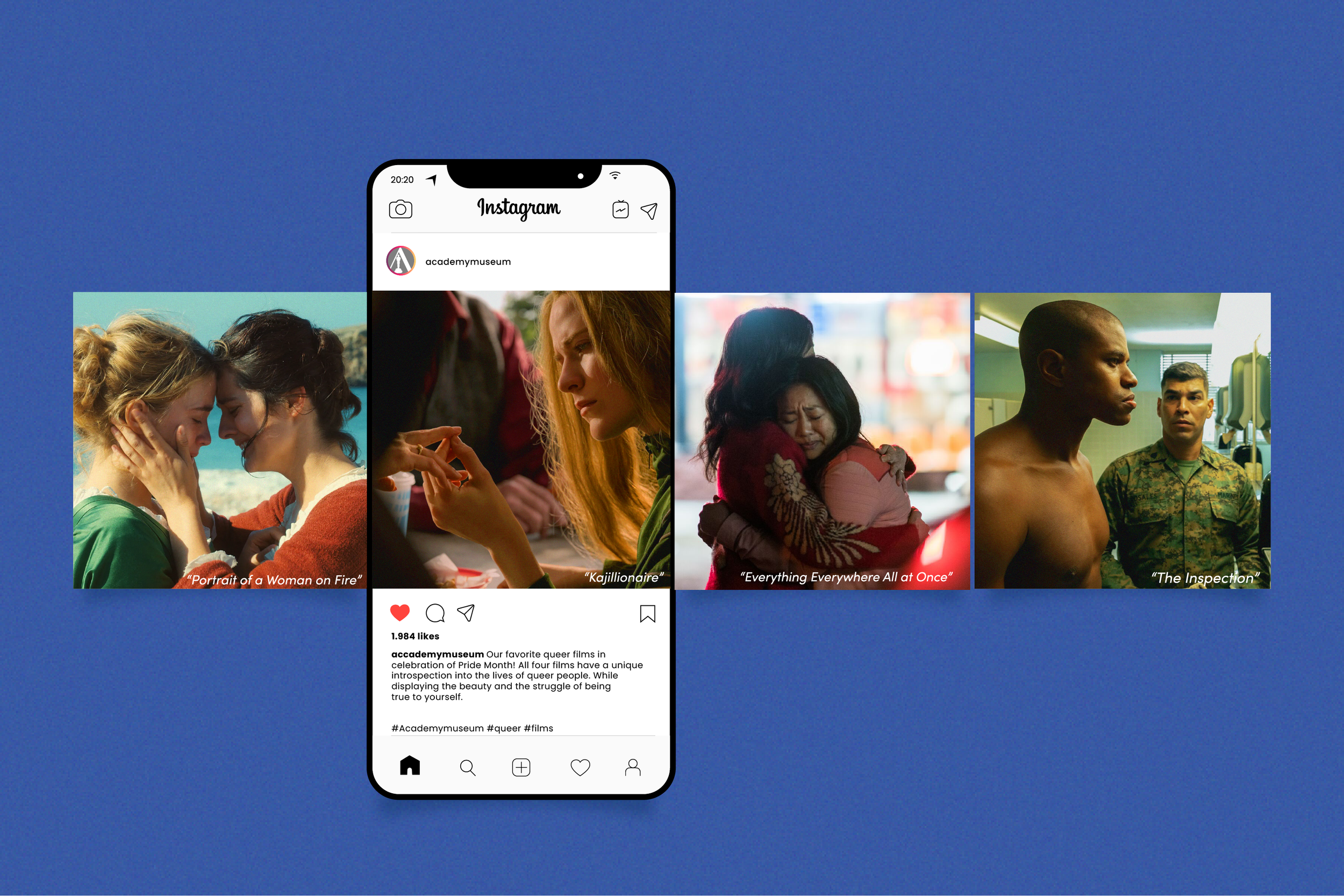
Their branding is effective in portraying the lasting and established history of the brand while also keeping a contemporary feel. However, I felt like the opportunity that was being missed in the branding was featuring the movies more prominently. The scenes that stand as iconic or inspiring that allows for a more minimal and engaged feel. I also believe it would give a chance to incorporate the logo more within the brand and create a new market for younger generation of viewers.
CURRENT WEBSITE & LOGO
Redisigning AMMP
With my rebranding I wanted to feature a monochromatic base color scheme and add a splash of a brighter color for most of the logo branding while physical items like tickets and other printables feature CMYK colors that were saturated and bold. the color scheme could go many different ways as whatever movie scene was being featured within the marketing would influence the colors being used.
To show more of how exhibits would be marketed I made a small concept board that features how might the branding would be used and how modular the concept is.
AMMP
Logo Design
I wanted to take the current logo and simplify it more that used practically little typography. I chose to take the “A” from academy and place the Oscar within. The font I used (Viola) had a natural pyramid shape with no horizontal bar crossing the A. I also developed a minimal acronym logo that could be effective in social promotion.
MAIN LOGO
ALTERNATE LOGO
AMMP Final Deliverables
I chose to focus on developing a brand guide that would give insight into how to use the logo and what type of imagery to feature. I also created exhibition examples and merchandise that would be sold within the museum. Lastly, I focused on ticket designs to make them collectable that would keep collectors coming back throughout the season.
Gift Shop Project Add-on
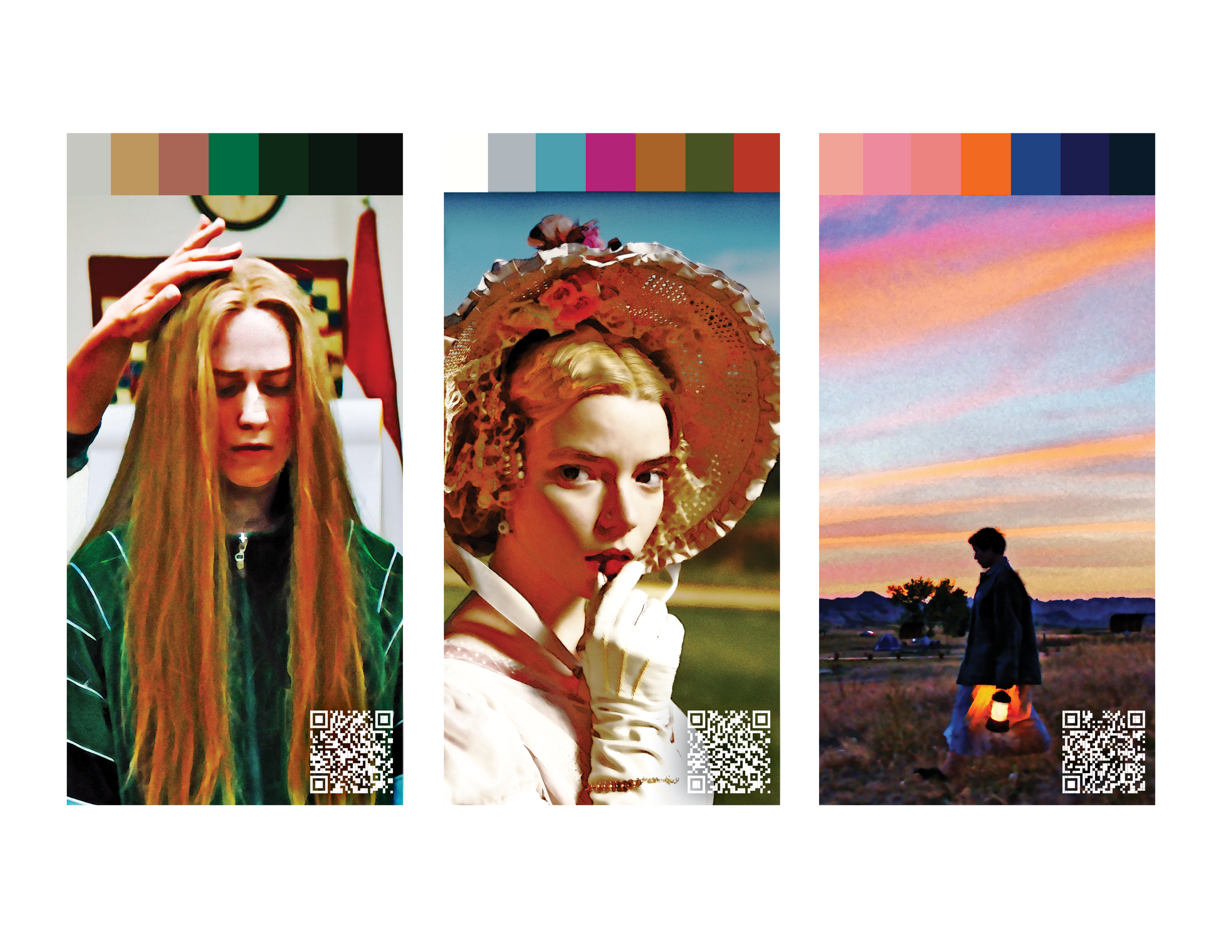
This idea was attached to the rebrand while I was working on a different project that was developing a pack of cards that could be a modular and the subject matter could shift in order to reach all different demographics and audineces.
This project features films created by female directors and would feature a QR code that would lead to an IMDB page that gave a rundown of that director. Each card features a unique color palate made completely from the scene represented within the image. each image would contain a visually iconic moment from each movie rendered in a nostalgic and visually grunge aesthetic.
The main audience for this would be film buffs, collectors, and creatives and with a layout set up It could be used to do multiple different additions, somewhat inspired by cards against humanity and other add-on packs.


